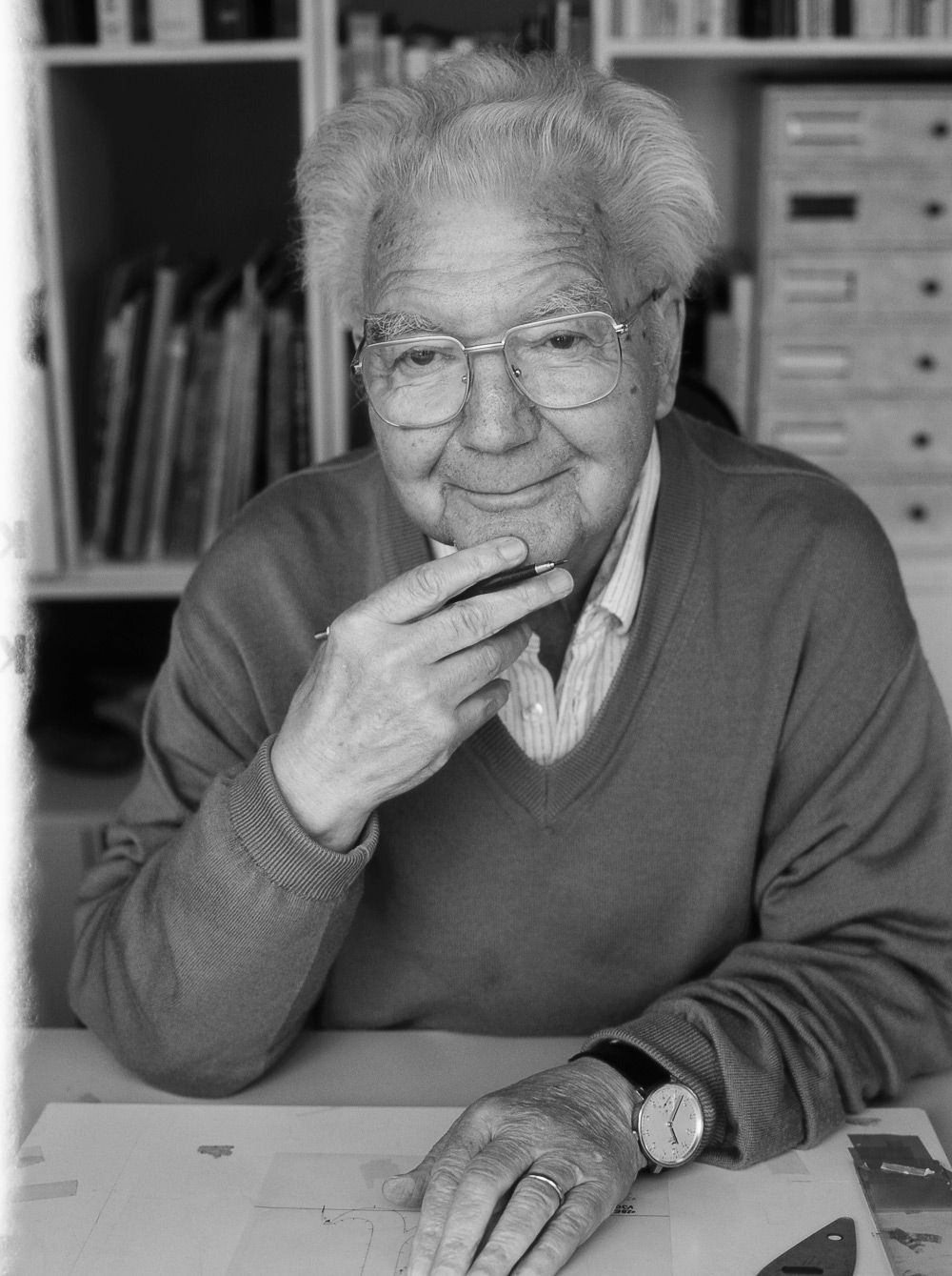
If you've ever wondered who Adrian Frutiger is, now is your chance to find out! Adrian Frutiger is a Swiss typographer, best known for his development of the Univers font family. Born in 1928 in Switzerland, Frutiger was interested in sculpture, but was strongly encouraged by his father and teachers to pursue a career in printing instead. He complied, but never lost his love for sculpture. At 16, he began working as a printer's apprentice in his hometown. He then moved to Zurich to study from 1949 - 1951 and, in 1952, he was hired as an artistic director by Deberny & Peignot, a well-known type foundry of the time, located in Paris. Between the years of 1954 - 1957, he worked to develop the Univers font family, which gained him international acclaim. He developed numerous type faces for the world and also developed custom font faces for businesses and corporations, including the Charles de Gaulle Airport, BP, and Shiseido.
Adrian Frutiger
In 1960, he left to start a design studio alongside two partners. From this platform, he worked with branding, signage, maps, and more. He was a teacher at l'Ecole Estienne in Paris for ten years and at l'Ecole Nationale Supérieure des Arts Décoratifs in Paris for eight years. As a designer and typographer, he has received a number of formal honors, recognizing his significant work in the field. He has also written a number of books about typography and design.
One characteristic that aided Frutiger's success was his willingness - and eagerness - to embrace new technologies as they were developed. This allowed him to keep up with the times and develop his typefaces and designs in accordance with modern standards.
Sources:
http://typophile.com/node/12118
http://www.identifont.com/show?110
http://www.eyemagazine.com/feature/article/reputations-adrian-frutiger