Wednesday, November 12, 2014
An Interview with Richard Misrach
Here's a great video interview with Richard Misrach about his work, his inspiration, and the ideas he hopes to convey through his photography.

Richard Misrach, Photographer
Richard Misrach is a photographer who was very influential in the 1970s and helped pioneer color and large-scale photography. He is currently the most well-known for his ongoing series, Desert Cantos, a complex photographic study of how man relates to nature. He also did a series called Cancer Alley, a series of photographs taken within the industrial corridor along the Mississippi River, and On The Beach, aerial photos of human interactions on the beach.
Compound Words:
Some links:
http://ellies-creative-works-vu.blogspot.com/2010/04/huge-fan-of-richard-misrach.html
http://potd.pdnonline.com/2010/01/3367
http://www.berkeleyside.com/2011/08/01/richard-misrach-a-focus-on-the-after-story/
http://seesawmagazine.com/misrachpages/misrach_interview.html
http://www.high.org/Art/Exhibitions/Richard-Misrach-Exhibition.aspx


50 Words that Describe His Work:
|
||
|---|---|---|
| color political landscape time story communication composition beauty effective emotional researched thorough process study light inspired sublime |
response tragic aftermath cause and effect disaster life death vantage point weather desert beach fire hurricane cancer industrial irresponsibility society |
nature documentary detailed clear ominous relationship waiting patience propaganda contemporary environment radiation aesthetics sociology ecology historical |
Compound Words:
Beautiful-communicative
Human-tragedy
Industrial-ecology
Time-story
Flawless-detail
Environment-propaganda
Environment-propaganda
Some links:
http://ellies-creative-works-vu.blogspot.com/2010/04/huge-fan-of-richard-misrach.html
http://potd.pdnonline.com/2010/01/3367
http://www.berkeleyside.com/2011/08/01/richard-misrach-a-focus-on-the-after-story/
http://seesawmagazine.com/misrachpages/misrach_interview.html
http://www.high.org/Art/Exhibitions/Richard-Misrach-Exhibition.aspx


Monday, November 3, 2014
The History of Typography
The History of Typography by Ben Barrett
Type is Power.
Type is Timeless. But always changing.
Barrett-Forest describes the evolution of fonts, where they came from, how they've changed, and why they've changed. It all started with Gutenburg and the very first printing press, but changed over time due to need to more legibility, less density, and more contrast. The First Industrial Revolution brought exciting changes because of the ability to print more precisely. The Second Industrial Revolution brought advertising, which made demands for larger, bolder typefaces. With the 20th Century came the simplification of fonts. With the invention of the computer, more experimentation was allowed, and gave anyone the ability to design their own typefaces.
To me, it is extremely fascinating how closely the evolution of typography is tied to the events in history and how those events shaped and dictated the formation of new typefaces for various uses according to the specific needs of the time and the technology that was available!
Sunday, November 2, 2014
FUSE Designers
Tobias Frere-Jones is an American typographer based in NYC. He graduated from Rhode Island School of Design with a Graphic Design degree in 1992 and joined the Font Bureau in Boston. It was there that he created some of the most well-known fonts of the company including Interstate, Poynter Oldstyle, and Poynter Gothic. In total, he has designed of 700 font faces for retail, clients, and his own experimentation! Top clients have included The Boston Globe and The New York Times and his work has been featured in numerous leading art journals.

Website: http://www.frerejones.com/
Source: https://en.wikipedia.org/wiki/Tobias_Frere-Jones
http://www.frerejones.com/about/
Gerard Unger was born in the Netherlands in 1942. He studied graphic design and typography at the Gerrit Rietvald Academy in Amsterdam from 1963-1967 and has gone on to work in many aspects of the field, as a free-lance designer, a teacher and professor at various universities, and a type designer. He has done work in a majority of arenas from stamps and coins to magazines, newspapers, and books, to corporate branding and identities. One of his books has been translated into 5 different languages. He is now based in Brussels, Belgium and is a frequent lecturer on type design and other design topics.

Website: http://www.gerardunger.com/
Source: http://www.gerardunger.com/biography/biography.html
https://en.wikipedia.org/wiki/Gerard_Unger
Barry Deck is an American designer from Iowa, born in 1962. He graduated from Northern Illinois University in 1986. After pursuing his masters degree at the California Institute of Arts, he moved to New York and was recognized for his radical new ideas in the field of type design. He has been known for his distorted typefaces that play with and blur ideas of legibility. In 1995, he established his own company and has worked for companies such as Pepsi, Reebok, and Nickelodeon.

Website: http://www.barrydeck.com/
Source: http://www.identifont.com/show?1HV
Rick Vermeulen was born in the Netherlands in 1950. He graduated with a degree in graphic design from the Rotterdam Academy in 1972. After college, he often did work for the publisher, Bert Bakker, and worked with Rotterdam's Graphic Workshop, who worked to organize cultural events such as the Rotterdam Film Festival. From 1978-1982, he worked for the magazine Hard Werken, with a small group of other designers. Eventually, the group established their own studio under the same name. Vermeulen moved to Los Angeles in 1993 and continued work for Hard Werken. In 1995, he moved back to the Netherlands. More recently, he has designed typefaces for FUSE and has done collaboration work as well as freelance work for a number of clients.

Source: http://www.eyemagazine.com/feature/article/reputations-rick-vermeulen
Paul Elliman is a Brittish designer, born in 1961. He is well-known for his typeface Found Font, which is an ongoing project to create a typeface using found objects such as plastic, wire, and metal. He is also known for his font, Alphabet, which he designed for FUSE. He first came to fame for his work with the Brittish jazz magazine, Wire. He doesn't produce a lot of work, but the work he does is always well received.

Source: http://www.eyemagazine.com/feature/article/other-spaces
Anna-Lisa Schoenecker is a designer based in Mainz, Germany. She received her masters in Communication Design from the Royal College of Art. Her career began with Pentagram where she worked on editorial and corporate design. Her work for FUSE consists of her typeface White No Sugar and she has been recognized for her work in Women of Graphic Design 1890-2012. She now lives and works in Germany and is a teacher of Information Design and Interactive Media at the University of Applied Sciences in Mainz.

Website: http://www.schoenecker.com/
Source: http://www.schoenecker.com/index.php?/in-brief/about-me/
Website: http://www.frerejones.com/
Source: https://en.wikipedia.org/wiki/Tobias_Frere-Jones
http://www.frerejones.com/about/
Gerard Unger was born in the Netherlands in 1942. He studied graphic design and typography at the Gerrit Rietvald Academy in Amsterdam from 1963-1967 and has gone on to work in many aspects of the field, as a free-lance designer, a teacher and professor at various universities, and a type designer. He has done work in a majority of arenas from stamps and coins to magazines, newspapers, and books, to corporate branding and identities. One of his books has been translated into 5 different languages. He is now based in Brussels, Belgium and is a frequent lecturer on type design and other design topics.
Website: http://www.gerardunger.com/
Source: http://www.gerardunger.com/biography/biography.html
https://en.wikipedia.org/wiki/Gerard_Unger
Barry Deck is an American designer from Iowa, born in 1962. He graduated from Northern Illinois University in 1986. After pursuing his masters degree at the California Institute of Arts, he moved to New York and was recognized for his radical new ideas in the field of type design. He has been known for his distorted typefaces that play with and blur ideas of legibility. In 1995, he established his own company and has worked for companies such as Pepsi, Reebok, and Nickelodeon.
Website: http://www.barrydeck.com/
Source: http://www.identifont.com/show?1HV
Rick Vermeulen was born in the Netherlands in 1950. He graduated with a degree in graphic design from the Rotterdam Academy in 1972. After college, he often did work for the publisher, Bert Bakker, and worked with Rotterdam's Graphic Workshop, who worked to organize cultural events such as the Rotterdam Film Festival. From 1978-1982, he worked for the magazine Hard Werken, with a small group of other designers. Eventually, the group established their own studio under the same name. Vermeulen moved to Los Angeles in 1993 and continued work for Hard Werken. In 1995, he moved back to the Netherlands. More recently, he has designed typefaces for FUSE and has done collaboration work as well as freelance work for a number of clients.
Source: http://www.eyemagazine.com/feature/article/reputations-rick-vermeulen
Paul Elliman is a Brittish designer, born in 1961. He is well-known for his typeface Found Font, which is an ongoing project to create a typeface using found objects such as plastic, wire, and metal. He is also known for his font, Alphabet, which he designed for FUSE. He first came to fame for his work with the Brittish jazz magazine, Wire. He doesn't produce a lot of work, but the work he does is always well received.
Source: http://www.eyemagazine.com/feature/article/other-spaces
Anna-Lisa Schoenecker is a designer based in Mainz, Germany. She received her masters in Communication Design from the Royal College of Art. Her career began with Pentagram where she worked on editorial and corporate design. Her work for FUSE consists of her typeface White No Sugar and she has been recognized for her work in Women of Graphic Design 1890-2012. She now lives and works in Germany and is a teacher of Information Design and Interactive Media at the University of Applied Sciences in Mainz.
Website: http://www.schoenecker.com/
Source: http://www.schoenecker.com/index.php?/in-brief/about-me/
Wednesday, October 22, 2014
More Meta Characteristics
The font, FF Meta, has many characteristics that are typical of computerized fonts. The Meta font family includes small caps font faces. Small caps are very different from all caps and the difference is very important. In all caps writing, the words shout at you from the page. In small caps fonts, however, the words are emphasized, but do not stick out extensively.

Ligatures are also included with the FF Meta Font. Ligatures are when two letters are combined to make one character. Common examples are fl, ff, and fi. The latest versions of FF Meta contain ligatures, but they are not contained in the older version that I have. An example of this can be seen in my previous post.
A foot mark is sometimes also called a "dumb apostrophe". It is a line that extends straight downward in the place of an apostrophe. A "smart apostrophe" however, is curled to the left. Smart apostrophes are far more visually appealing and are encouraged in typography in almost all circumstances.
This same difference is seen in inch marks versus quote marks. Inch marks are quotes that extend straight down, while quotes curl right to open and left to close.
A hyphen - is used only to hyphenate words or add line breaks. An en dash – is approximately the width of a capital N and is used to denote duration, such as in October – December, or 3 – 5 years of age. An em dash — is twice as long as the em dash, about the width of a capital M and is used in ways similar to parentheses or indicates an abrupt change in thought.
Tuesday, October 14, 2014
Typfaces and Definitions
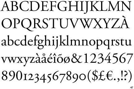
Old-Style Typfaces:
-were originally developed in the 15th and 16th centuries
-are based off of handwritten letter forms
-are generally characterized by angled serifs and low variance in stroke weight
Example:
Garamond


-were originally developed in the 15th and 16th centuries
-are based off of handwritten letter forms
-are generally characterized by angled serifs and low variance in stroke weight
Example:
Garamond
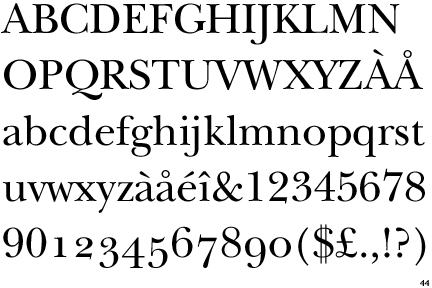
Transitional Typefaces:
-bridge the gap between Old Style typefaces and Modern typefaces
-are characterized by more vertical axes and sharper serifs
Example:
Baskerville
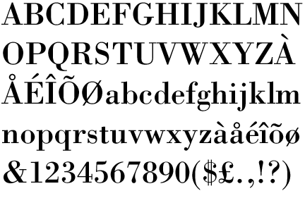
Modern Typefaces:
-were originally developed in the late 18th and early 19th centuries
-were considered a radical difference from traditional typography
-are characterized by stark contrast in stroke weight, straight serifs, and straight vertical axes
Example:
Bodoni
Definitions:
Stroke Weight: the measurement of a stroke based on how thick or thin it is
Stress or Axis: the diagonal, horizontal, or vertical transition from thick to thin in a stroke
Small Caps: when a typeface uses smaller versions of the capital letters as the lowercase
Lining Figures: numerals that are the same height as the rest of the typeface and rest accordingly on the baseline
Non-Lining Figures: numerals that are not the same height as the rest of typeface and may at times extend below the baseline and vary in height
Ligature: two or more letters combined into one character. Popular examples include fl, ff, and fi
Type Measurement: type size is usually defined by points. Typically, 1 point=.013837 inches and 12 points=1 pica. Hence 72 points=1 inch. While typefaces do not follow this system religiously, in theory, a letter set at 72 points will be approximately 1 inch tall.
Type anatomy: terms include baseline, cap height, x-height, ascender, descender, arm, shoulder, leg, tail, eye, apex, crossbar, counter, bowl, link, ear, loop, aperture, and more... Best described by a picture
Sources:
http://www.designishistory.com/1450/type-classification/
identifont.com
http://tympanus.net/codrops/2012/05/09/understanding-the-lingo-typography-glossary/
http://desktoppub.about.com/od/glossary/g/Lining-Figures.htm
http://desktoppub.about.com/od/glossary/g/Non-Lining-Figures.htm
http://desktoppub.about.com/od/glossary/g/Ligature.htm
http://desktoppub.about.com/cs/intermediate/a/measure_type.htm
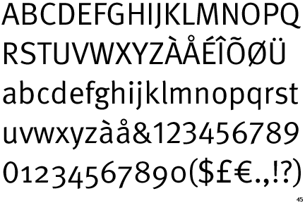
FF Meta
FF Meta is a Sans Serif font, developed by Erik Spiekermann in 1985. It is classified as a Humanist Sans Serif font. Spiekermann has designed many other fonts, including Berliner Grotesk, the Officina font family, Info font family, and Unit font family. The FF Meta font family includes over 60 fonts, including Roman, Italic, Bold, Black, and variations of these. There are also MetaPlus fonts, which are Small Caps fonts.
Spiekermann has also released a separate font family called FF Meta Serif, the counterpart to FF Meta.
Spiekermann has also released a separate font family called FF Meta Serif, the counterpart to FF Meta.
Subscribe to:
Posts (Atom)