Wednesday, October 22, 2014

More Meta Characteristics

The font, FF Meta, has many characteristics that are typical of computerized fonts. The Meta font family includes small caps font faces. Small caps are very different from all caps and the difference is very important. In all caps writing, the words shout at you from the page. In small caps fonts, however, the words are emphasized, but do not stick out extensively.


Ligatures are also included with the FF Meta Font. Ligatures are when two letters are combined to make one character. Common examples are fl, ff, and fi. The latest versions of FF Meta contain ligatures, but they are not contained in the older version that I have. An example of this can be seen in my previous post.

A foot mark is sometimes also called a "dumb apostrophe". It is a line that extends straight downward in the place of an apostrophe. A "smart apostrophe" however, is curled to the left. Smart apostrophes are far more visually appealing and are encouraged in typography in almost all circumstances.

This same difference is seen in inch marks versus quote marks. Inch marks are quotes that extend straight down, while quotes curl right to open and left to close.

A hyphen - is used only to hyphenate words or add line breaks. An en dash – is approximately the width of a capital N and is used to denote duration, such as in October – December, or 3 – 5 years of age. An em dash — is twice as long as the em dash, about the width of a capital M and is used in ways similar to parentheses or indicates an abrupt change in thought.

Tuesday, October 14, 2014

Typfaces and Definitions

Old-Style Typfaces:
-were originally developed in the 15th and 16th centuries
-are based off of handwritten letter forms
-are generally characterized by angled serifs and low variance in stroke weight
Example:
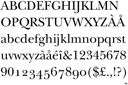
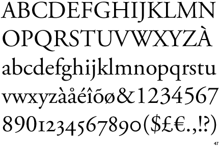
Garamond

Transitional Typefaces:
-bridge the gap between Old Style typefaces and Modern typefaces
-are characterized by more vertical axes and sharper serifs
Example:
Baskerville


Modern Typefaces:
-were originally developed in the late 18th and early 19th centuries
-were considered a radical difference from traditional typography
-are characterized by stark contrast in stroke weight, straight serifs, and straight vertical axes
Example:
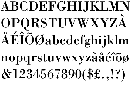
Bodoni

Definitions:
Stroke Weight: the measurement of a stroke based on how thick or thin it is
Stress or Axis: the diagonal, horizontal, or vertical transition from thick to thin in a stroke
Small Caps: when a typeface uses smaller versions of the capital letters as the lowercase
Lining Figures: numerals that are the same height as the rest of the typeface and rest accordingly on the baseline
Non-Lining Figures: numerals that are not the same height as the rest of typeface and may at times extend below the baseline and vary in height
Ligature: two or more letters combined into one character. Popular examples include fl, ff, and fi


Type Measurement: type size is usually defined by points. Typically, 1 point=.013837 inches and 12 points=1 pica. Hence 72 points=1 inch. While typefaces do not follow this system religiously, in theory, a letter set at 72 points will be approximately 1 inch tall.

Type anatomy: terms include baseline, cap height, x-height, ascender, descender, arm, shoulder, leg, tail, eye, apex, crossbar, counter, bowl, link, ear, loop, aperture, and more... Best described by a picture

Sources:
http://www.designishistory.com/1450/type-classification/
identifont.com

http://tympanus.net/codrops/2012/05/09/understanding-the-lingo-typography-glossary/
http://desktoppub.about.com/od/glossary/g/Lining-Figures.htm
http://desktoppub.about.com/od/glossary/g/Non-Lining-Figures.htm
http://desktoppub.about.com/od/glossary/g/Ligature.htm
http://desktoppub.about.com/cs/intermediate/a/measure_type.htm

FF Meta

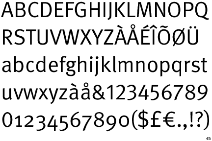
FF Meta is a Sans Serif font, developed by Erik Spiekermann in 1985. It is classified as a Humanist Sans Serif font. Spiekermann has designed many other fonts, including Berliner Grotesk, the Officina font family, Info font family, and Unit font family. The FF Meta font family includes over 60 fonts, including Roman, Italic, Bold, Black, and variations of these. There are also MetaPlus fonts, which are Small Caps fonts.

Spiekermann has also released a separate font family called FF Meta Serif, the counterpart to FF Meta.