Paul Rand
Paul Rand, born Peretz Rosenbaum, lived from 1914 to 1996. Just a month ago, there were people celebrating his would-have-been 100th birthday. Rand was an American designer, and was one of the founders of the Swiss Style of graphic design. He studied at the Pratt Institute, the Parsons School of Design, and the Arts Student League between the years of 1929 and 1934. His family did not support his decision to pursue art as a career and, as a result, much of Rand's learning he taught himself by studying magazines of European art and design. He changed his name to Paul Rand at a young age to distance himself from his Jewish community, which was somewhat condescending of his work. Beginning in his college days, his reputation as a designer grew throughout the rest of his life. He was well known for his work of the 1950's and 60's doing corporate logos for companies such as IBM, ABS, Ford, and UPS, which are still in use today (except for UPS, which caused a huge controversy when they decided to change their branding after Rand's death).
Sources:
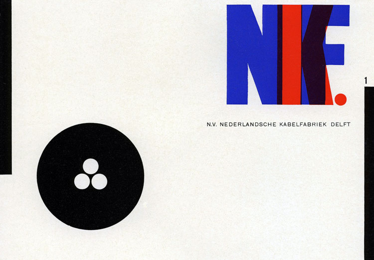
Max Huber
Max Huber was a Swiss born graphic designer. He was born in 1919. At the age of 17, he entered the Zurich School of Arts and Crafts. He was full of ideas and, along with a few friends, helped launch what is now referred to as the International Typographic Style. This system relies heavily on a grid system, use of right and left margins, sans serif fonts, and clear, structured layouts. At 21, Huber moved to Milan, which gave him the opportunity to experiment with merging together illustration, printing, photography, and painting. He went on to do a great deal of freelance design and enjoyed working in tandem with his clients.
Sources:
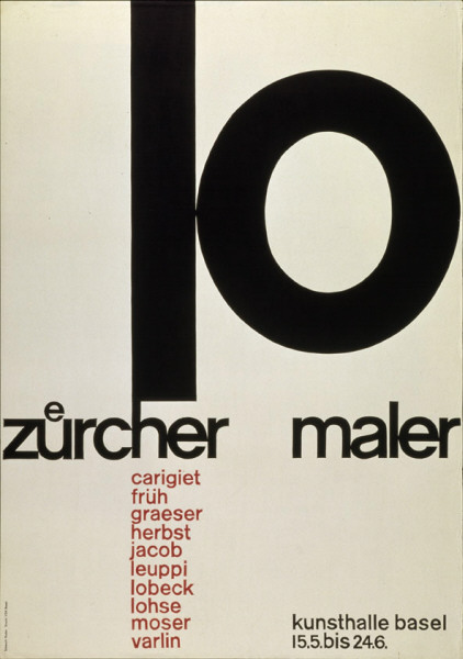
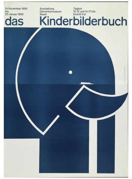
Emil Ruder
Emil Ruder was born in Switzerland in 1914. He worked alongside Armin Hofmann in developing what is known as Swiss Design. Ruder began his design career at age 15 with a design apprenticeship. He went on to study at the Zurich School of Arts and Crafts. In 1947, he became a typography instructor at the Basel School of Design. In his work with Hofmann, they together began to steer away from the former stylized designs and focus more on precision, cleanness, and legibility. Ruder ad a love for sans serif fonts, and clear and concise typography in his work. He also embraced asymmetry, paying close attention to weight and white space. The Univers font family, developed by his friend, Adrian Frutiger, inspired him and he and his students did numerous experiments with mixing the various font weights.
Sources:
El Lissitzky
Shying away from the Swiss born designers, we have El Lissitzky from Vitebsk, Russia. Lissitzky, born Eleazar Markovich Lisitskii in 1890, was an artist, typographer, designer, photographer, and architect who did a considerable amount of work for Soviet Russia in early 1900's. He studies architecture in Darmstadt from 1909 to 1914. In 1921, he became a professor at the Moscow Art Academy. In addition, between 1921 and 1925, he worked as Russian propagandist in Germany, the Netherlands, and Switzerland. Much of his work involved propaganda for the Soviet Union including posters, books, buildings, and exhibitions. In his work, he contributed a lot of ideas that gave aid to the Suprematist, Bauhaus, and Constructivist art movements. Lissitzky did a lot of work with abstract art, using various shapes, which he called proun, to balance the space in his works.
Sources:
Piet Zwart
Piet Zwart was born in the Netherlands in 1885. From 1902 to 1907, he studied at the School of Applied Arts in Amsterdam. Teachers were not always present or active in the classroom, so much of his education at the School was self-imposed. After graduating, Zwart applied his education to furniture, interior and fabric design, but after World War I, decided to pursue a different route. In 1919, he began his graphic design career as a draftsman for a well-known architect of the time. Though formally trained as an architect, Zwart is now best known for his work as a designer. He was heavily influenced by the De Stijl style of art, but began to move away from its strictly abstract form. In the early 1920's, he began to experiment with typography. He would go on to refer to himself as a typotekt, a mixture of the words typographer and architect, saying that he built pages with type.
Sources: